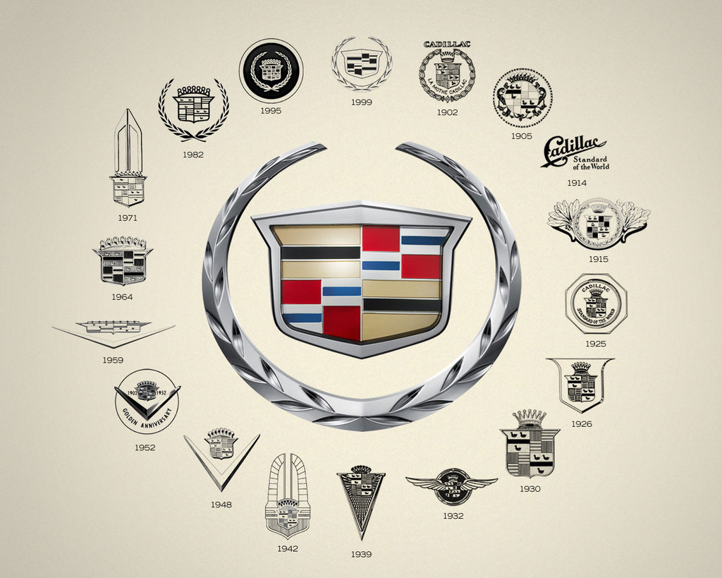
The year was 1998, Cadillac started making "art and science," a new design language, for its models. They called on the services of Anne-Marie La Verge-Webb, a graphic designer in the corporate and brand identity group for GM, to redesign the Cadillac emblem. The aim of the new design theme was to combine hints of high technology and elegance using faceted shapes. La Verge-Webb drew inspiration from a stealth fighter and gemstones.
She studied the evolution of the Cadillac emblem throughout history. They examined grilles, trunks, and even rare items from a special collection in the Warren design studio. She wrestled with whether the change would be "evolutionary or revolutionary." She opted for evolutionary with a little more drama.
The very first Cadillac logo was based on the crest of the Cadillac family. The Detroit Company was founded in 1701 by Antoine de La Mothe, Sieur de Cadillac, a Gascon officer and minor aristocrat. His family's coat of arms seems to have been an adaptation from a nobler neighbor. And this is fitting to a car that has always been the choice of self-made men or the hustler who just hit it big. As for the new logo, it was imperative that it matches the new body theme. The designers wanted the logo to look like part of the grille and not something that was just fastened to it.
The novelty of the look was to be high tech, or what they termed as "milled from solid metal." The group settled on major alterations to the traditional crest and wreath emblem. They unveiled the new "wreath & crest" logo at the gathering of collectors and designers of the 1999 Pebble Beach Concours d'Elegance.
The shield carried the colors from the Cadillac tradition which was red, silver and blue, black and gold on a platinum background, thought to suggest high technology. But the crown topped with pearls was removed as well as the merlettes or ducks from the original coat of arms. The leaves of the wreath were mechanized by adding-in facets. The outcome hinted at Piet Mondrian's artwork.
The merlettes or ducks had been utilized in an infamous advertisement for the Cadillac Catera. The slogan was "the Cadillac that zigs instead of zags," with one of the ducks swimming in the opposite direction from the majority. Many thought that the ducks contributed to the failure of the Catera. Thus, the merlettes were removed from the new logo.
The designers wanted to make it "less fussy, more technical." The goal was to make it look like it was "milled out of a single billet of aluminum." The ducks made it look fussy.


0 comments:
Post a Comment