History of Mitsubishi

0 comments
The origin of Mitsubishi goes back to 1870, when the founder, Yataro Iwasaki, started a shipping firm with three aging steamships. Yataro's brother, son and nephew expanded the business into various fields during their respective terms as president and set the foundation of the Mitsubishi companies. After WWII, the original Mitsubishi organization was disbanded to become independent companies as they are today. Here is a summary of the 130 years history shared by the Mitsubishi companies.
The history of "Mitsubishi" parallels the story of modern Japan. The founder, Yataro Iwasaki was from the prefecture of Kochi on the island of Shikoku, which was the home of the powerful Tosa clan. He worked for the clan and distinguished himself in managing its Osaka trading operations. In 1870, he set up his own shipping company, Tsukumo Shokai, with three steamships chartered from the clan. This was the beginning of Mitsubishi.


The company grew rapidly while undergoing a number of name changes including Mitsukawa Shokai, Mitsubishi Shokai, Mitsubishi Jokisen Kaisha (Mitsubishi Steamship Company), Yubin Kisen Mitsubishi Kaisha (Mitsubishi Mail Steamship Company).
Mitsubishi Mail Steamship Company inaugurated service to China and became the first Japanese company to open an overseas route. But the political winds shifted against Mitsubishi in the early 1880s, and the government sponsored the establishment of a competitor. The ensuing competition nearly bankrupted both companies.

Yataro died of cancer in 1885 and his younger brother Yanosuke succeeded him as president of Mitsubishi. The feud between Mitsubishi and its competitor ended with a government-arbitrated merger the same year, which created Nippon Yusen--today's NYK Line.
While competition was escalating on the sea, Mitsubishi was diversifying ashore. The company purchased the Yoshioka copper mine in Okayama and Takashima coal mine in Nagasaki. It leased and then purchased the Nagasaki Shipbuilding Yard from the government in 1884 and later engineered Japan's first domestically produced steel steamship there.

Yataro Iwasaki
In 1885, Yanosuke Iwasaki succeeded his elder brother, Yataro, as head of the Mitsubishi organization.
After the independence of NYK, Mitsubishi continued to grow and diversify under the autocratic leadership of Yanosuke. He bought up more mines to provide resources for Mitsubishi and Japan's growing industries.
He also incorporated the Mitsubishi organizations as a modern corporation. Yanosuke set about rebuilding the organization around its mining and shipbuilding businesses. He expanded the organization's positions in banking, insurance and warehousing, and thus laid the foundation for future growth and development.
In 1890, he purchased 80 acres of the land next to the Imperial Palace now known as Marunouchi.
Yataro's son, Hisaya, assumed the presidency in 1893. The University of Pennsylvania graduate restructured Mitsubishi to support increasingly diverse business operations. He set up divisions for banking, real estate, marketing, and administration, as well as for the original mining and shipbuilding businesses.
Some of Hisaya's private investments are part of today's Mitsubishi companies. He purchased the Kobe Paper Mill, which is today's Mitsubishi Paper Mills, and he backed the founding of Kirin Brewery. His cousin Toshiya founded Asahi Glass, Japan's first successful manufacturer of plate glass.
Hisaya insisted on the observance of firm ethical principles in business dealings. After the outbreak of WWI in 1914, he called on all the Mitsubishi employees to redouble their commitment to integrity and fairness.
Philanthropy was a lasting emphasis for Hisaya. He donated to the city of Tokyo two expansive Japanese gardens - Rikugien and Kiyosumi-Teien, and established Toyo Bunko, a library for housing oriental works.
Koyata Iwasaki, the son of Yanosuke, took over the presidency from Hisaya in 1916 at the age of 38. Like Hisaya, he had studied abroad and was a graduate of Cambridge University. He led the Mitsubishi organization for nearly 30 years and played a pivotal role in shaping the development of Japanese industry.
Under Koyata, Mitsubishi was modernized further as the divisions were incorporated into semiautonomous companies. Koyata steered Mitsubishi to leadership in such sectors as machinery, electrical equipment, and chemicals. The companies that later became Mitsubishi Heavy Industries developed automobiles, aircraft, tanks, and buses. And Mitsubishi Electric also became a leader in electrical machinery and in home appliances.
The Iwasaki family relinquished some of its control over Mitsubishi through a public offering of shares in the core holding company. By the end of World War II, outside investors held nearly one-half of the equity.
Koyata encouraged his managers and employees to stand above the xenophobia that swept Japan during the war years. "We count many British and Americans among our business partners," he reminded Mitsubishi executives shortly after the outbreak of hostilities. "They are our friends who have undertaken projects together with us and who have shared interests with us. Should peace come again, they should again become our partners."
After the war, the allied occupation forces demanded that Japan's big industrial groups disband. The last Mitsubishi president, Koyata Iwasaki, resisted conforming to the demands but unfortunately passed away in 1945. Mitsubishi Headquarters disbanded on September 30, 1946, and many of the Mitsubishi companies subsequently split into smaller enterprises.
The old Mitsubishi organization ended in 1946. The Mitsubishi holding company was dissolved while the trading house fragmented into hundreds of independent enterprises. Most of the Mitsubishi companies abandoned the name and emblem under pressure from the occupation forces.
In 1952, the San Francisco Peace Treaty was concluded and Japan regained a welcome place in the international community.
In 1954, more than 100 companies that had been part of the trading house, Mitsubishi Corporation, merged to reestablish that company. Similarly, the principal components of Mitsubishi Heavy Industries reunited in 1964. Mitsubishi companies that had abandoned that name after the war began using it and the three-diamond mark again.
Japan was the scene of unprecedented economic growth in the 1950s and 1960s, and the Mitsubishi companies were very much a part of that growth in their established industries and in new ones.
To commemorate the centennial anniversary of the founding of the first Mitsubishi company, the Mitsubishi companies established the Mitsubishi Foundation in 1969. The companies are also active individually in supporting worthy causes through their own charitable foundations and in other ways.
Mitsubishi pavilions have been highlights of expositions in Japan since the historic EXPO'70 in Osaka in 1970. In every way, the companies take part actively in the life of the community they serve.
Read more ►

Redesigning the Cadillac Logo

0 comments

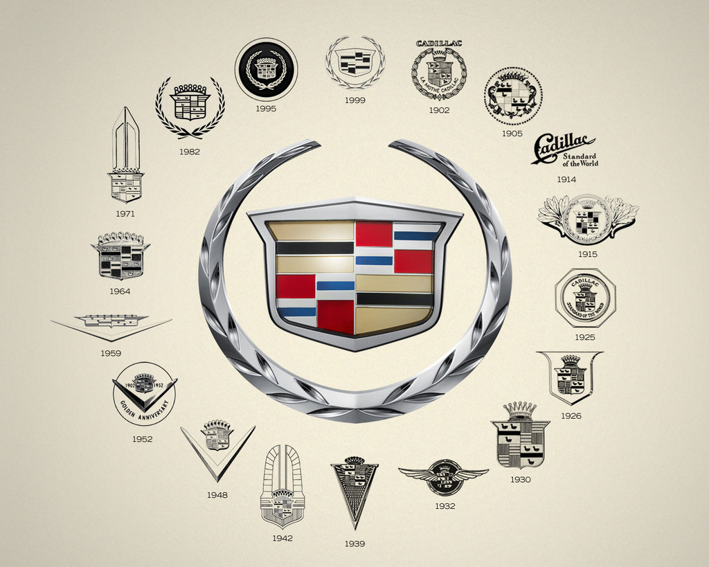
The year was 1998, Cadillac started making "art and science," a new design language, for its models. They called on the services of Anne-Marie La Verge-Webb, a graphic designer in the corporate and brand identity group for GM, to redesign the Cadillac emblem. The aim of the new design theme was to combine hints of high technology and elegance using faceted shapes. La Verge-Webb drew inspiration from a stealth fighter and gemstones.

She studied the evolution of the Cadillac emblem throughout history. They examined grilles, trunks, and even rare items from a special collection in the Warren design studio. She wrestled with whether the change would be "evolutionary or revolutionary." She opted for evolutionary with a little more drama.

The very first Cadillac logo was based on the crest of the Cadillac family. The Detroit Company was founded in 1701 by Antoine de La Mothe, Sieur de Cadillac, a Gascon officer and minor aristocrat. His family's coat of arms seems to have been an adaptation from a nobler neighbor. And this is fitting to a car that has always been the choice of self-made men or the hustler who just hit it big. As for the new logo, it was imperative that it matches the new body theme. The designers wanted the logo to look like part of the grille and not something that was just fastened to it.

The novelty of the look was to be high tech, or what they termed as "milled from solid metal." The group settled on major alterations to the traditional crest and wreath emblem. They unveiled the new "wreath & crest" logo at the gathering of collectors and designers of the 1999 Pebble Beach Concours d'Elegance.

The shield carried the colors from the Cadillac tradition which was red, silver and blue, black and gold on a platinum background, thought to suggest high technology. But the crown topped with pearls was removed as well as the merlettes or ducks from the original coat of arms. The leaves of the wreath were mechanized by adding-in facets. The outcome hinted at Piet Mondrian's artwork.

The merlettes or ducks had been utilized in an infamous advertisement for the Cadillac Catera. The slogan was "the Cadillac that zigs instead of zags," with one of the ducks swimming in the opposite direction from the majority. Many thought that the ducks contributed to the failure of the Catera. Thus, the merlettes were removed from the new logo.

The designers wanted to make it "less fussy, more technical." The goal was to make it look like it was "milled out of a single billet of aluminum." The ducks made it look fussy.

http://drivesteady.com/wp-content/uploads/2011/02/cadillac_logos.jpg


http://fc01.deviantart.net/fs36/f/2008/277/3/2/cadillac_logo_by_nikita144.jpg


http://www.pilgrimways.com/window/wp-content/uploads/2010/06/cadillac_logo_detail.jpg


http://www.corvetteconti.com/blog/wp-content/uploads/cadillac-logohistory625.jpg

Read more ►

Insurance Logos

0 comments

The world has become an insecure place to live. At every stage we require assurances that we will live longer. Our valuable assets need as much security. Hence for the last thirty decades insurances of various kinds have mushroomed. It started with health, then cars, accident policies, home security... you name it and there is an exclusive company catering to our needs. On offer are insurances for - travel, for child's education and senior citizens. The insurance logos play an important part as the fascia of the company; the customer has decided to confide in. A distinct and clear identity helps both- the company to relate to the customer and vice-versa.

The insurance sector is large and many big corporate have diversified into various sub-categories. They lure people to buy coverage, invest in policies and pay premium annually. It is a big business and quite profitable. Many players compete with each other to remain in public domain. Naturally each company needs branding and awareness with the investors. The best way is to create a brand identity that makes one familiar with the company and its policies. Hence the importance of insurance logos is critical. Like health care companies, insurance companies are also service providers. They need serious and very communicative branding with an underlying message that attracts the policy holder. Since insurance cover comes with many risks, any company offering a group of policies needs a careful communication with prospective customers. There fore designing the logos for such organisations needs in depth research of the insurance sector. The branding exercise will encompass the values and policies of the companies. It will also have simple, inspirational and effective icon which pleases the public.

Aviva is UK's largest and the world's fifth largest insurance group. It provides life and pension products to whole of Europe and has substantial businesses around the world. The group has an apposite logo that goes perfectly well with its image. It's written in all caps using a serif font which is very trust-inspiring. It also positions the company as people-friendly. The blue colour of the font has a soothing effect. On the left is a quadrilateral patch with a combination of three colours- a large portion of blue, a thin slit of yellow and small patch of green. Yellow colour is known to fight fears and phobias and boosts self-esteem, while green symbolizes balance, harmony and prosperity.

http://waterdamagemoldwestlakevillage.com/insurance_logos.gif

http://www.swansonwithyou.com/images/insurance_logos.gif

http://www.free-press-release.com/uploads/news/2011/04/08/1302286108_img0.jpg

http://www.sibgroup.co.uk/images/logo-group.jpg

http://insuranceglobe.net/images/insurance_logos_quote_form.gif

http://ccyasika.files.wordpress.com/2011/02/insurance-logos.jpg

http://www.jamesryanthornhill.co.uk/imageFiles/home_logos.gif

http://www.logodesignworks.com/images/insurance-logos/insurance-logos-2.jpg


Read more ►

Super Six Best Text Logo Designs in the World of Brand Marks

0 comments
Successful brands always strive to make their brand marks distinct and memorable. If their business marks are recognized and remembered by the customers then the company will be too.

Below mentioned are some of the best trademark designs that have been a major contributing factor for the company's success.

1. Disney
https://blogger.googleusercontent.com/img/b/R29vZ2xl/AVvXsEjpITld3XlE39GIAB-Eh-xkYMU38TSmjFBrM_lgVXRd-ibS5dq_RQC3ghJhsiYFoUNtbtRRPeJmIF4TjDxcqJ74a7em0H3oa8P_8osBbfR5ANcgGANPzxR3dUXYbxqZlEO5VXXxV6MiZmo/s1600/disney-logo.jpg

This is one of the best text logos ever as it distinct, unique and perfectly represents its business nature. As a company that strives for imagination and innovation, their emblem is a perfect depiction of the same. The straight but scripted fonts are easy to understand yet unique and curvy enough to be imaginative.

2. IBM
http://img12.nnm.ru/4/1/7/0/8/41708e66d0cd5494304f6753bb0c280a_full.jpg

Very few companies can create a mirror image of their trade nature but IBM has done that quite successfully. Their trademark consists of eight blue and white horizontal stripes which represent equality in service. The blue color also represents trust and dependability. The horizontal lines combined with straight fonts also give a high tech look to the symbol.

3. Johnson & Johnson
http://www.sma-eu.eu/images/stories/smaimages/johnson-and-johnson-logo.jpg

Their fonts may be scripted but because they are straight they are easily readable. The combination of black and white colors is also sophisticated and timeless which makes this simple text emblem one of the best in the industry.

4. MTV
http://blindgossip.com/wp-content/uploads/2011/07/MTV-logo-2.jpg

For a music channel, it is important to be appealing to the youth yet be compact enough to fit one edge of the TV screen. The MTV fulfills this criterion. Even though it is a simple text mark, the placement of the letters is appealing and distinct. The thick M letter combined with the crooked TV gives a youthful yet professional edge to the emblem which has been a major contributor to its success.

5. Ford
http://www.carlnc.com/Dbg_Board/DownImg/Ford(26).jpg

It is only through the simplicity of the design that it is gained attention. This famous car company's emblem consists of the company name in scripted fonts in a silver white color with the background in a shaded blue colors. The entire symbol is surrounded with a silver colored oval border. The blue and silver colors add an air of sophistication to the design while the script fonts add a traditional look.

6. Kellogg's
http://storykorea.co.kr/uploaded/signal/1316658140.jpg

The red color of the monogram is eye catching and energetic which is perfect to represent a product related to food. The script fonts used here are placed at an alignment to give a playful aura to the emblem. The use of minimal colors makes it uncomplicated and memorable which is what makes this symbol one of the best text logo designs ever.


Read more ►

5 Wild Animal Logo Ideas to Make Your Brand Mark Earn Respect

0 comments
The easiest way to make your brand mark look menacing and intimidating to its competitors is to use images of wild creatures in your company trade mark design. That way you can tell the world that you mean business and you are here to stay. Using untamed creatures in your company symbol generates fear and demands involuntary respect at the same time which can be perfect for the cut throat competition in this world.

Top five wild animal logo ideas that you can use in your business mark design are:

1. The cats
http://www.santiagosaints.cl/wp-content/uploads/2011/04/geelong_logo_.jpg

They don't call a Lion the king of the jungle for no reason. Cats signify self-confidence, grace, dominance, speed and strength and all that is done with style. When you look at a company image with a big strong cat, you wish to own it so that some of those animal qualities would rub off you. So whether you are associated with the hotel industry, media house, a car manufacturing company or a sports team, this is the perfect mammal that says supremacy with style.

2. Crocodile
http://a2.att.hudong.com/43/98/01300000009843120054985151101_s.jpg

Strong and egoistic, this animal is as powerful on land as it is in water making him the object of horror and anxiety in both the places. For a brand that wants to convey the same message to its customer and competitors, this is the symbol for you. A croc image will give the message loud and clear that 'whatever comes in its way will be eliminated'. It is perfect for any business existing in a competitive industry, i.e. a clothing line, a telecommunication company or a cologne company.

3. Snakes
http://www.rocksource360.com/storage/site-images-2009/RS360SnakesLogo500SQ.png?__SQUARESPACE_CACHEVERSION=1253974703748

Sneaky, poisonous and sinful, this reptile is perfect to instigate your opponents' deepest fears and worries. Also symbolizing grace, wisdom and temptation, you can use this animal in your company pictorial if your business is related to creativity and innovation. For example, for a women's clothing line, you can use an image of a snake swirling through the company name or a jeweler can use an image of a snake with a diamond on its head.

4. Bull
http://content.sportslogos.net/logos/30/819/full/6fzn6ljfgggzo8dmp09y.gif

Feared for its aggression, hostility and strength, this animal never fails to intimidate its viewers. An image of a red eyed and raging bull with its nostrils flaring can scare the living day lights out of all. This is the perfect choice for a company mark image if you are creating a design for a sports team, a beverage company or a bar. The universal representation of a bmx animal logo is also a bull that represents the bicycle motor-cross stunts.

5. Shark
https://blogger.googleusercontent.com/img/b/R29vZ2xl/AVvXsEg5IMYXFduYszNqKJM5oUjktR-I3ZdFep2dCpXE93Hr16PwWMdi5hM7kYOthA4RtlRduScL0SBq0RM96npgI7Sp-_bhjU14USMq0UQ2sI_r3EMp915gF29bVF5O4xbygPc_EDwXJDLwgrcy/s1600/ps1+master+jogos(www.baixamaster.net).jpg

A shark is probably the most feared animal in the world thanks to the movie Jaws. A rightly designed image of a shark in your company design can tell its viewers that you mean business. In this world of cut throat competition, a shark image is the best way to portray aggression, violence and anger which can be perfect if you are trying to intimidate a rival sports team or designing a brand mark for a private investigation company.


Read more ►

Auto Logo Design - Uniqueness Can Work Wonders

9 comments
Passion, Speed and attitude, these things altogether make an auto logo design. No matter if your business is about water boats, heavy trucks or aircraft supplies your corporate identity should appear as a style icon because only a stylish brand representation will grab the attention of automotive lovers to purchase what you offer.

When designing an automobile logo design you should remember that it should depict the exact business theme e.g.; if your company specializes in spare parts of heavy bikes then you may draw parts related to heavy bikes in your corporate identity, especially those ones that are most asked by automotive lovers. It is also important to use right colors in it in order to stay in this business theme. Red, black and blue are the best colors to put in your corporate identity as they depict the elements of power, speed and trendiness.

You can look at some car graphic design samples before starting to create your vehicle business identity as it is very important to gather all the information or inspirational piece of graphics to come up with a nice creation.

However, you must make sure that you don't re create something that has been made by some other graphic designer because this can probably cost your entire business name that you have earned, as it is a big mess to face someone who accuses you of copying his art work.

What is the nature of your particular industry and its USP that is unique selling proposition? USP when employed creates striking encroachment in the minds of the viewers. USP (Unique selling proposition) in your product is a unique expression which will assist in planting unique brand identity in the market.

Unimpeachably, auto logo design that is unique, awe-inspiring and inspiring will take your business on the top.

Ending up with something over the top is not a layman's job; you have to look out for someone who can fork out the desired results. Best advice to get a best corporate identity is to hire professional graphic design services; it will pay your dividends later on. There is a heap of graphic design services in the market and no doubt it's confusing to select the best one out of them to get your brand identity.

Therefore, you have to consider many aspects before finalizing a graphic design service, conduct a brief research work, short list companies, have a look on your budget and then decide which company would be useful for you and your automobile logo design.

Hence, you have to be very creative while designing your automobile logos because a unique logo can work wonders for your business firm.

Jessica Thompson works as a Senior Design Consultant at a Professional Logo Design Company. For more information on automobile logo find us at Logo Design Consultant.

http://www.logodesignworks.co.uk/images/auto-logos/uk-auto-logos-9.jpg


http://www.logodesignworks.co.uk/images/auto-logos/uk-auto-logos-17.jpg


http://www.logodesignguru.com/images/logo_images/automotive_logo_design.jpg


http://www.customdesignbusiness.com/logo_portfolio/auto_logo_design2.png


http://img.uuhy.com/uploads/2010/09/611-car-logos.jpg


http://websiteslab.com/images/portfolio/auto-source.jpg


http://www.customdesignbusiness.com/logo_portfolio/auto_logo_design.png


Read more ►

How to Design a Custom Logo

2 comments
There are many companies, institutions and corporations which are remembered, respected and recognized through their uniqueness that they construct in the structure of brand identity parts and logos. Nobody goes back and notice the people after any organization, they only recognize image by considering the optical identity that provide as external aspect for the people. Anything aesthetical, imaginative and practical investment anybody who has created in designing brand identity, everyone must look forward to same reaction from the objective section.

If any organization utilized forms to design and modern colours in logo, it will recognized as a pioneering organization with imaginative supervision. If the emblem provides mechanical and extra technical appearance not including any creative look and encouraging, it will recognize as a conformist organization with customary loom. These logos offer an opportunity to make the first and long-term impression.

Logo create is both skill and science to accomplish a unique yet imaginative look of the component of the organization. Resourcefully designed logos needs various artistic conclusions and simultaneously, they are planned and designed by brand planning who comprehend the importance that they are available to put to the coming years. It is not the work of graphic operators or anybody who can job on graphic tools, it is the essential plan and stimulation that progresses classics in logo design market.

Nobody has gone back to understand the three lines which comprises the MERCEDES logo. These circles and three lines are including very profound viewpoint which rules the entire corporate figure and trade profound of the Mercedes cars. These three lines show that this company generates vehicle for the sea, air and roads and further round depicts the cosmos. It is not a logo it is the statement of Mercedes company plan and viewpoint that is included in the trade itself. Logos must include the combination of graphics and text. These emblems are the brand marks that show the core values and business viewpoint of any organization. Logos should more hnspirational, attractive and imaginative as well. They should be conversing scheme and a viewpoint after aesthetical design.

http://www.harley-davidsonaccessory.com/wp-content/uploads/2011/08/Custom-Logo.jpg

http://www.webappers.com/img/2010/03/logo-myway.jpg

http://www.thebusinesslogo.com/logo-design-gallery.gif

http://www.ramgraphix.com/images/Custom%20Logos.jpg


Read more ►

Custom Logo Design Services - A Must For Every Start Up

1 comments
Before you leave for your summer holiday trip to the hill side, check your car carefully for any problems it can have along the way so that you can fix them and ensure a smooth drive all the way. Just like that you have to look for any problems you might have on your way when you launch a new business. To get rid of these business problems one has to carefully diagnose and mediate them prior to business launch.

The largest problem with startup businesses is the inability of the professionals to design and execute a workable marketing strategy because they usually overlook or underestimate a number of marketing tools and without any doubt Business Logo is virtually the most despicable child in the marketing tools' family.

Very often startup business owners or their marketing team avoid hiring professionals to design their graphical business identity and try to come up with a logo themselves using all kinds of free offers available or hire some freelance logo designers to do it for them for the sake of saving a couple of bucks and to make it worse they settle for just a business name and completely abdicate the power of a logo.

Instead, all small business logos are actually an effective method of projecting the business before it is launched. As soon as people see your logo they identify it as an upcoming product without the detail knowledge of the product itself. This raises questions in their minds and they start trying to find out what your business is by analyzing your logo because they believe in their minds that there is a message in the logo and out of there human nature they start digging it. It creates those incomplete sentences in their minds which they try to fill in all the time.

Just imagine how incredible it would be for you and your business if it is launch at a point of time when this thirst for the product is at its peak and you are in the minds of everyone just because you had a business logo which was good enough to grab the attention of the people and make them wonder because you made an early decision to hire professional logo design service.

http://htecom.vn/public/upload/news/1298369524_thiet_ke_logo_2.gif

http://www.thebusinesslogo.com/logo-design-gallery.gif

http://www.davidwilliams.biz/images/logos/logo-virdee-medical-group.jpg

http://2.bp.blogspot.com/-q6_yhld4cdo/TrVkr1vsZvI/AAAAAAAADKQ/jrClNwFp9vc/s1600/logo-design-logos.gif


Read more ►

All Skateboard Logos

0 comments

In all honesty, there isn't really a history of skateboarding per se, because no one really knows for sure quite where the skateboard came from, or when it was invent, or even who invented it. There is one theory that states the concept may have come from the old soapbox cars that were made on platforms. Regardless of where it came from, anyone can see that it is now one of the most popular hobbies around and all skateboard logos are displayed nearly everywhere the products are sold, touting theirs as the very best.

Skateboarding today is among the most popular sports around, and it is a world wide passion, not only as a sport and recreational vehicle but also as an art form and a challenge to skateboarders. They seek to master the sport, applying various mechanics and tricks to make themselves able to very nearly fly. Whether the ramp or the halfpipe, the skateboarders of today continue to increase the difficulty and the challenge to themselves and for those who are really serious about the sport, their lives are all skateboard. Logos for the sport began to crop up not long after it began in earnest. Like all things sporting, or all trends in general, the skateboarding trend hit the business world hard and many groups who sponsored other sports or sporting events invested their time and money into developing various items for the sport that bore logos. All skateboard logos are not created equal, ask anyone who is a skateboarder.

In the beginning skateboarding logos started out as simply logos on the skateboard alone, which was applied on the skateboard deck, the aspect of the board that the skateboarder stands on to do his ride. Later, companies begain to manufacture equipment such as safety equipment and other clothing that also began to sport all skateboard logos across them.

These items include sweatshirts, workout gear, helmets, kneepads, elbow pads, and even up to and including the wheels of the skateboard. All of them have become liable to be emblazoned with all skateboard logos, from Adidas to Airwalk, nearly every company in the world who creates some kind of sporting equipment or shoes has gotten on board the skateboarding craze, and skateboard riders seem to select a favorite brand and become remarkable loyal to it, featuring the logos on nearly everything they wear when skateboarding, whether its for fun or for competition.

All skateboard logos have one thing in common however. They all sell a product, and having that product seen on the skateboard of one of the most famous skateboarders in the world makes it a hot commodity, so skateboard equipment manufacturers all want to get that particular person to wear their equipment, to the point that they will donate literally thousands of dollars of gear to the right guy or girl.

http://jmtboardrooms.co.uk/images/element_logo_black.jpg

http://www.images22.com/pics/02/skating-logos.jpg

https://blogger.googleusercontent.com/img/b/R29vZ2xl/AVvXsEjXXZecJPM41F4OBvW9VoQOmNS_5SjJXAGsUL3znR_lTNakfecvUKtwTbzYGkx46LaZuItcQ08lXPINZU0pRP2uChAmtSo0RumvQ3Y0Sxp8vO517l4mx6lUKWbUTja8gNurWup4x-mjRvc/s1600/Darkstar_Skateboards_Logo.jpg

http://skateboardlogos.org/wp-content/uploads/2008/08/skate-logos.gif


Read more ►

How to Get Your Dream Logo

0 comments

We all see dreams and we want them all to come true. However, in the real world, seldom do our desires and dreams come true. We have to go with the flow and do our best to achieve the best possible results. Whether we need a car, house, cell phone or job or anything else, we all like one thing over the other or one company over the other. However, it may not be possible to get what we need. For example, you may need an iPhone but you may not be able to afford it. Even though it may be your dream phone, but you will have to go to their competitors to buy a similar and a cheaper phone.

Now, when it comes to creating your brand identity, then you may have your dream logo in your mind, but you may be unable to give it a physical shape. However, there is actually an exception in the logo design industry. It's that if you manage to acquire the services of a professional design company then they will work closely with you to give a real shape to your dream logo and make it a reality. So, the key here is to find the right service with right options.

So, what we have learned so far is that your dream logo is something that can become a reality. All you need to do is to find a professional logo design service with right options. Now, what we need to do is to discuss those options to understand how your dream will actually come true.

See, the first and the foremost thing that you need to ensure is that the design company you are interested in will actually welcome your input and suggestions. Make sure that they ask you to fill out a creative brief to share your ideas and thoughts about your dream logo. This will allow them to begin the work in the right direction and create the initial draft according to your creative brief. Hence, it is crucial that you provide as many details as you can about your logo to ensure that it becomes a reality.

The next thing that you need to look for is the number of revisions they will provide. Getting your dream logo right in the first attempt is impossible, so you will need several revisions to play with the initial concept and mold it according to your liking. So, you need to check and see the number of revisions that the design company is going to offer. The best thing is to get Unlimited Revisions with your purchase. This way you will be able to give the desired look to your logo easily and conveniently.

Now, you must ensure that the company doesn't use any clipart in your logo, but they create everything from scratch. Your imagination is as unique as your business and, thus, it must be reflected in your logo as well. If your logo is not unique, then you will fail to give a unique touch to your business.

http://www.bridgat.com/files/GET_YOUR_DREAM_JOB_NOW_1.jpg

http://www.blogohblog.com/wp-content/pop/2009/12/logobee-logo.jpg

http://www.mylifemydreammyturn.com/wp-content/uploads/2010/10/MLMDMT_logo.jpg

http://customlogodesignusa.com/wp-content/uploads/2012/04/how-it-works.png

http://aext.net/wp-content/uploads/2011/08/logo-bee-positive-800.jpg


Read more ►

How to Design*a Logo

0 comments

Corporations, companies and institutions are recognized, respected and remembered through their identity that they create in the form of logos and other brand identity components. No one goes back to see the people behind any company; they only perceive our vision by seeing our visual identity that serve as outer facet for the public. Whatever creative, aesthetical and functional investment anyone has made in designing his corporate or brand identity, one must expect similar response from the target segment.

If the company has used modern colors and forms to design it logo, it will be perceived as an innovative company with a visionary management. If the logo gives mechanical and too much technical look without any inspirational and artistic look, it will be perceived as a conventional company with traditional approach. Logos gives us chance to create our first and lasting impression, otherwise, the company will have to undergo reshaping of its image to impress the target audience.

Logo design is an art as well as a science to achieve an attractive yet creative outlook of the facet of your company. Professionally designed logos requires a lot of creative decisions and at the same time, they are designed and planned by brand strategists who understand the value that they are going to add towards the next few years. It's not a job of graphic operators or anyone who can work on graphic tools; it's the basic idea and inspiration that evolves classics in log design world. Modern logos have to be fewer officials but more of an interactive statement of the company vision and objectives. No one has ever gone back to know the three lines which constitutes the MERCEDES logo.

These three lines and a circle are having a very deep philosophy which governs the whole corporate stature and business philosophy of the Mercedes cars. These three lines depicts that Mercedes Company manufactures vehicle for the road, air and sea. Round represents the universe. It's not just a logo; it's a communication of Mercedes business strategy and philosophy that is incorporated in the business itself. Logos are much more than a blend of text and graphics. These logos are the brand symbols that represent the core values and business philosophy of any company. Logos have to be more inviting, inventive and inspiring. They should be communicating an idea and a philosophy beyond their aesthetical design. This is all it takes to design an impressive logo for any company or brand.

http://htecom.vn/public/upload/news/1298369524_thiet_ke_logo_2.gif

http://www.shopwesternmichigan.com/uploads/logo-samples.jpg


http://www.garysimon.net/images/logo_tut/12.gif


Read more ►
 

Copyright © collection logo Design by O Pregador | Blogger Theme by Blogger Template de luxo | Powered by Blogger